Wednesday, May 27, 2015

Art Final Exam - Part 3

MOST SUCCESSFUL:
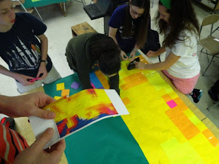
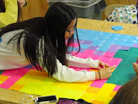
I think that my most successful piece of art was the post-it note project. We used both our technology and art skills to construct this masterpiece. I developed my art skills by learning to pixelate a photo and change the color scheme in photoshop. We voted on our favorite ones and I did not win, but my picture was of Barack Obama. I also created original art because I did something I had never done before and would not think to do. I was really happy with the outcome and it was hung in the mall and later in our school.


DO OVER:
If I could do over any project it would be my beach painting. I worked really hard on it, but was not happy with it. I wasn't completely finished either. I wanted to add a palm tree in the front. I wish I could do over the clouds because I want to change the color of them and make them wispy-er, and lighter at the bottom. I want to make the depth more realistic by making the beach a different color and making in grainy. Then I would make ripples in the ocean and different parts of the water go up higher on the beach. This is the final product and I wish it was not.

Art Final Exam - Part 2


I Take Risks:
                Our project was to create a perspective painting; showing something in the front and something in the back. I took a risk in painting. I also took a risk in trying to show the depth and show that the ocean was far away from the beach. I was planning to put a large palm tree over the front which would be a large risk since I have never done that before and you cant erase it if its bad. I would have tried this if i had enough time. The risk in painting is that you can't go back. I tried to make the sunlight reflecting in the water and the foam meeting the beach. I also took a risk in doing the clouds because I had never done them before. I have not used acrylic or the thick canvas before.

Art Final Exam - Part 1

Art Piece - SKITTLES BAG


           Although it looks like there was no technology used in creating this piece of art, we would not have been able to make it correctly in a short period of time without a computer and projector. The project that we were given was to create art out of balloons. We could use other material, but the balloon(s) had to be the center of attention. Other groups made a tree or a flower, but Mr. Sands was very creative and helped us think of an original idea. He came up with a bag of skittles, the balloons being skittles. We took it to the next level. We went to the mail room and got paper to make the bag bigger than a regular skittles bag. We pulled up a picture of the bag on the computer and used the projector to project the image onto the board (picture #2). We taped the red paper to the board and traced and painted the words onto the paper. This made the words proportional to the large bag size and the font was exactly the same. We painted the balloons with the skittles trademark "S" and put some of them inside the bag. We hung up the bag and hung up some of the balloons artistically so that it looked like they were falling out of an open bag (picture #6).

Technology Piece - FRAME PICTURE

          This assignment was to show personality through a frame. I took a picture of Morgan in behind the auxiliary gym where there is a lot of graffiti on the ground. I thought that this was artsy. Morgan was dressed up so I wanted to make it look like she was not where she belonged. She is going to a calm, serene place that matches who she is. I was able to use technology when doing this. In photoshop, I used the polygonal lasso tool to remove the background. I pasted the picture onto the beach scene. I placed Morgan to the right of the sun because the light source is on the left in that picture and cannot be changed. I copied and pasted the shadow from the original picture of morgan into a new layer and darkened it so that it looked like a shadow on the beach sand. I was only able to do all of this with the use of photoshop on the computer.

Part 2  - beach painting
Part 3 - post it note

Thursday, May 21, 2015

12 Days of Photoshop: Day 6 - Movie Poster

My movie poster parody is of The Adventures of TINTIN
I took out the text and re wrote it and added some dindin for tintin.

12 Days of Photoshop: Day 5 - gif

It was my birthday and no one made me a cake so I had to make one myself. I wanted it to be realistic so I made some of the candles flicker. I did three layers of different looking candles for six of the lights. I used the smudge tool, contrast and brightness tool, warp tool and transformation tools to alter the candle lights.

Wednesday, May 13, 2015

12 Days of Photoshop: Day 2 - True Identity

Caitlin is a KANGAROO?!?!?!?!
I took a picture of Caitlin in the classroom and cut out the background using the polygonal lasso tool. Then, I placed her on a field. I took a picture of a cat on its hind legs and removed the background. After that, I colored the cat black and turned the opacity down to 64% so that you could see the grass through the cat picture. I cut off the tail because it went over the hill. I also don't think that Caitlin's true identity has a long tail like in the cat picture. I wasn't able to make Caitlin's feet look like they were in the grass and I couldn't get the proportion of Caitlin to the field correct. I think she should be smaller but yano...

12 Days of Photoshop: Day 1 - Sliced Elephant


jThe first project in the 12 days of photoshop was to slice something or someone in half! I used a round select tool to cut and past half of the elephant into a new layer. I used the same select tool to take a portion of nuts from a picture. I placed it where I thought the stomach would go. I added a shadow to give depth to the stomach and i drew in a shadow of the whole elephant so that it would look like it is standing. I colored it a grey that is similar to a shadow

Elephant full of nuts

Grid Illusion Drawing

Monster Toy Project


Tuesday, April 28, 2015

Post-it Note Project: Paul Walker

The post-it note project is a portrait of a person made entirely out of sticky notes. We took a picture of Paul Walker and altered it in Photoshop. We changed the contrast, color scheme, and pixel size. After printing this picture, my group used half of the face as a guide. Each pixel of color represented one sticky note. We filled the whole poster with sticky notes and hung it in the Cary Towne Mall :-)


Sunday, March 22, 2015

Frame Photoshop


Morgan let me borrow a picture of her stepping into/ out of a frame. In Morgans picture, the light source is coming from the left. So, the image i chose has a light source on the left. I first used the Polygonal Lasso Tool to remove the background of the frame picture. I couldn't get all of the strands of Morgan's hair, so i used the Blur Tool at a low opacity. This blended the frame picture into the background. I also created a shadow. i rock. I used the shadow from the frame picture and made it a new layer. I made it the same size and shape as the shadow from the frame picture but i changed the color so that it was more realistic. Morgan is pretty. The sunset it also pretty. This shows Morgan's traits.

Newimal


I photoshopped this hippo head onto a seal's body.

The animal that I had for my AOIT zoo project is a sea lion. The sea lion is sitting on that rock. I love hippos and the hippo has the same body texture as a sea lion, so I put it's head on there. I used the Polygonal Lasso Tool to remove the background of the hippo picture. Then, I blurred the two pictures  together with the Blur Tool to make it look more realistic.

Sea lions are cool.
I hope our project is, too!!

Forced Perspective


Morgan, Hallie, Caitlin and I worked on capturing forced perspective photographs. We "spray painted" a cloud and stepped on each other.

Thats my foot in the second picture:))

Wednesday, March 18, 2015

Painting


1.) What does DPI stand for and what is the difference between a low DPI like 72 and a high DPI like 600?
DPI stands for 'Dots per Inch'. This is used to measure the resolution of an online image when printing.72 dots per inch will take less time to print but is at a lower quality. The printer only prints 72 pixels per square inch and can not usually display the image at its actual size. Higher DPI like 600 will take more ink and take longer to print, but it will be a much higher quality. The printer will print 600 pixels per square inch. The colors will blend more smoothly and the tonality will be better.

2.) What is an aperture and what do the different f stop settings mean?
Aperture is the unit of measurement that defines the size of the opening in the lens of a camera. This can be adjusted to control the amount of light reaching the film or digital sensor. The different F-stop settings are the steps of ratios of the lens's length to the diameter of the pupil of the eye. Its numbers represent a measure of the lens's speed. Each number represents half of the light intensity from the previous number.

3.) What is shutter speed and what difference does it make?
Shutter speed is the length of time that the shutter is open. It can either freeze an object in place or create a blurred image.

4.) What is ISO in photography?
ISO is the sensitivity of the camera to the available light. The lower ISO, the less sensitive the camera is to the light.

I wanted to do something simple for my painting so I chose a beach landscape. To show depth, I am going to do a large palm tree coming up from the bottom of the canvas into the middle. The pictures show my painting process. I started with the sunset and blended the sky. Then I did the clouds that are bad. Then I did the water with sunlight shining on it. I need to add waves and the palm tree to be finished!!


The link to my Pinterest board about paintings is below:

Monday, February 9, 2015

Comic Strip Project- Cartoon Final

I drew a comic about bread. It wanted to sunbathe but got sunburnt. I used crosshatching and blending of watercolor to display the pictures.

Thursday, February 5, 2015

Comic Bones Project

For this project, I chose the animated character Simba, from The Lion King, to draw bone structure. I used a similar structure to that of an actual lion cub's skeleton. The first picture is a traced copy of Simba on a translucent sheet of paper. After coloring it to match the animated character, I outlined Simba again and drew his bones.
What is the difference between anime and manga?

  • Anime, which comes from the word 'animation', is a TV show or animated cartoon. Manga is a graphic novel with similar looking characters.
What is the difference between graphic novels and comic books?
  • Graphic novels are a longer composition with a complex storyline, or plot. Comic books has several short plots within its composition.

How are panels designed and lay out in comic books, newspapers and graphic novels?
  • The author of a comic book often chooses how to lay out the panels within the story. Newspaper cartoonists often have one row of the same sized panels in order to maximize space for other information or cartoons. In graphic novels, there is more  creativity in panel size and shape because the story is longer.

I also created a board on pinterest where I researched different animated characters, or comics.
The link to my pinterest board is https://www.pinterest.com/marykatewalden/comic/ 

Photoshop Project

For my photoshop project, I combined a picture of myself with a picture of eight Disney princesses. After this, I photoshopped a background of the Disney World castle behind the first two layers.  I removed the white from the background of the princess pictures and erased part of me so that it looked like I was leaning in from behind Ariel. Although I didn't add a drop shadow, I tried to place the characters so that they still had a shadow from the background picture.